露品牌
——露品是一个医美品牌,根据其品牌特征,将“露”字与“品”字相结合,所以将“露”字进行简化,与“品”字结构相同,加强了品牌的形象设计感。又根据这是一款医美品牌,所以将“口”型设计为了简约的瓶子形象,不仅符合品牌形象而且既具有特色。亮眼的橙色为朴实的纯色进行了调味,使人眼前一亮。经过这一行的变化,使字形设计与图形设计进行了结合,明显的显示出了品牌形象。
Lupin is a medical and aesthetic brand. According to its brand characteristics, the word "Lu" is combined with the word "product". Therefore, the word "Lu" is simplified and has the same structure as the word "product", which strengthens the image design sense of the brand. According to this is a medical brand, so the "mouth" design for a simple bottle image, not only conforms to the brand image, but also has characteristics. Bright orange for the simple solid color seasoning, so that the eyes of a bright. After the change of this line, the combination of glyph design and graphic design shows the brand image obviously.
品牌升级策略:
佐兹为提供一下服务:
激发品牌生命原力
TIANYOU ZUOZI BRAND
-
TEL: 13601896741
Copyright © 2022
关注杭州品牌设计1微信 最新动态早知道
![]()
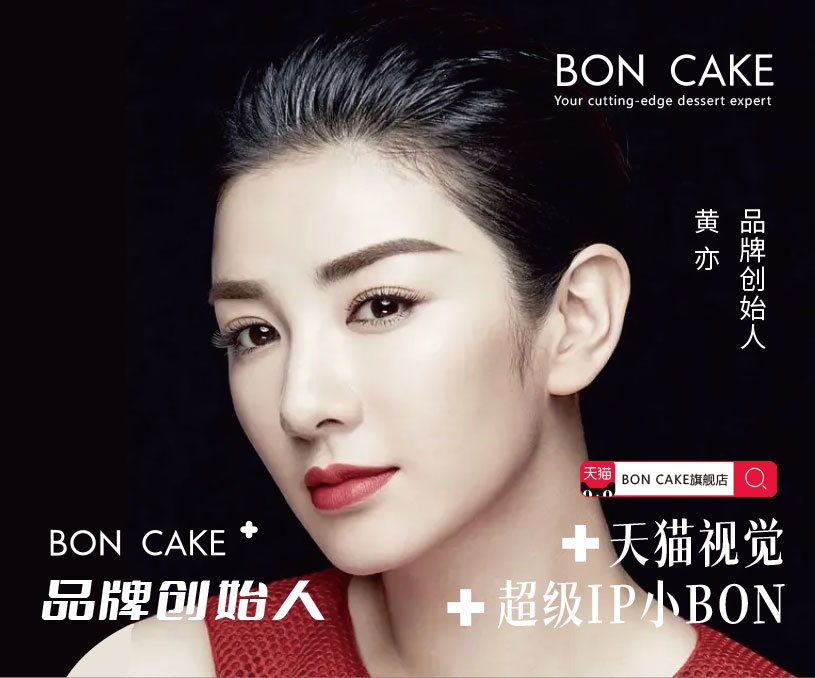
BON CAKE天猫店铺设计+超级IP设计
-
BON CAKE天猫店铺设计+超级IP设计
超级IP打造 小男孩蛋糕师傅形象盲盒《遇见蛋糕兔》× 手办玩具模型
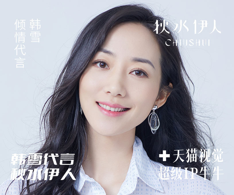
秋水伊人电商新视觉+超级IP
-
秋水伊人电商新视觉+超级IP
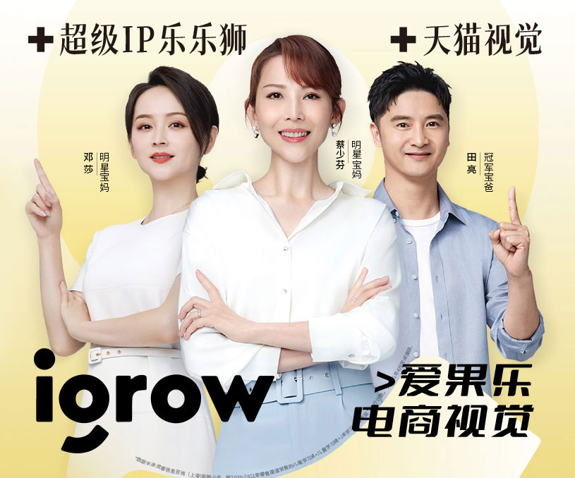
爱果乐天猫旗舰店 店铺设计 祥情页电商设计 超级IP设计
-
爱果乐天猫旗舰店 店铺设计 祥情页电商设计 超级IP设计
母婴市场消费升级加速,众多细分品类乘风起舞,这其中,儿童家居市场消费在高增长的同时正呈现出产品功能细分化、消费场景丰富化等显著特点。如果说在过去,安全性和舒适感是消费者的主要诉求,那么在今天,伴随着主流消费人群及其消费、教育理念的更迭,“功能性”和“场景感”日渐成为他们在选购儿童学习用品时最看重的要
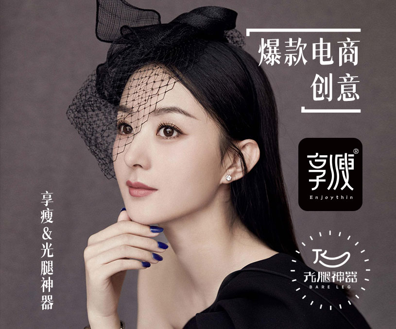
享瘦品牌光腿神器天猫旗舰店设计
-
享瘦品牌光腿神器天猫旗舰店设计
ENJOY THIN享瘦-时尚包装研设Make Women More BeautifulMade a professional research on clothing/Creating the Beauty of Fashion GirlsFashion, health and durabilityBeautiful and HealthierBare leg artifact/I'LL KEEP WORKING HARDSHOW YOU MORE WORKS/Thank You For Watching.
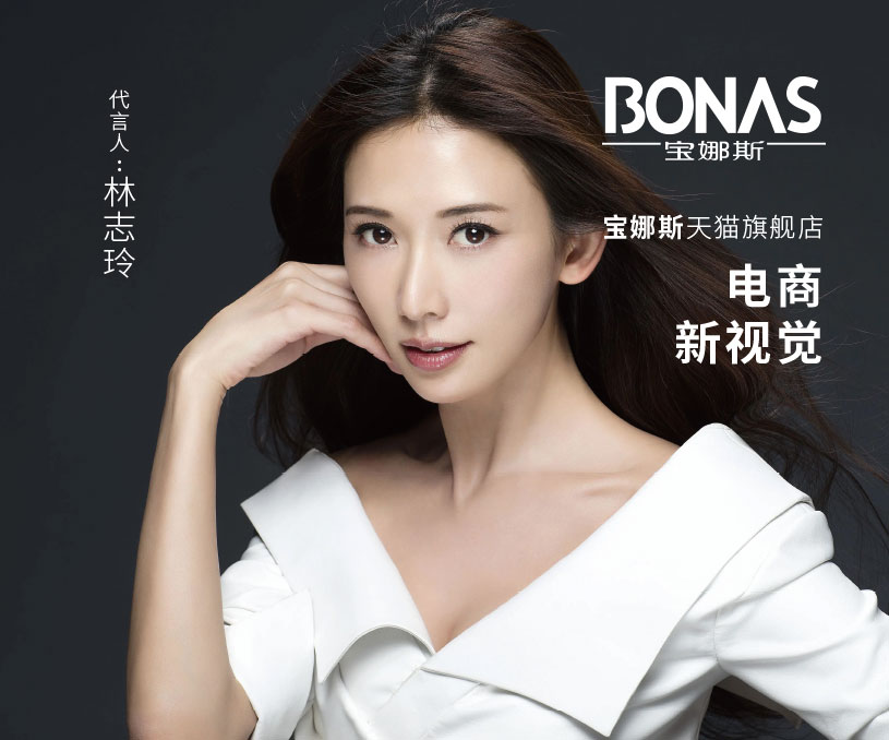
宝娜斯天猫旗舰店
-
宝娜斯天猫旗舰店
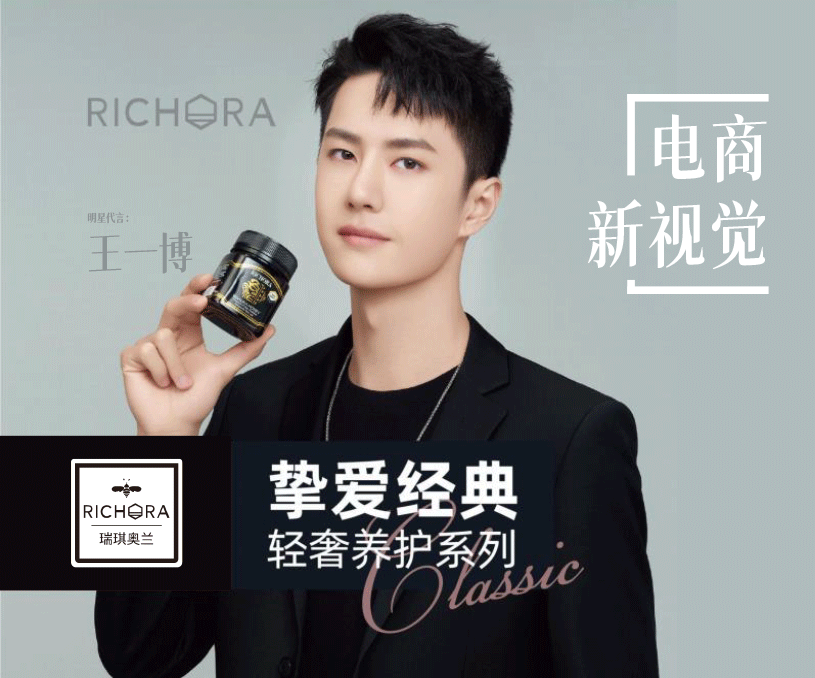
瑞琪奥兰天猫旗舰店
-
瑞琪奥兰天猫旗舰店
RICHORA 瑞琪奥兰 2000年创立于新西兰北岛中部世界著名旅游城市ROTORUA罗托鲁瓦,这里位于东经176度、南纬38度,是新西兰麦卢卡蜂蜜的黄 金产区。 这里也是新西兰神秘毛利文化的发源地、流传着毛利民族最伟大的爱情故事…… RICHORA在新西兰毛利语中代表着“丰富与满足、健康与活力”,四位英武帅气的创始人、文化官代
为中国品牌加油


